• Skip to primary navigation
  • Skip to main content

Illuminations

  • Buying Guides
  • Styles & Trends
    • Bathroom Lights
    • Ceiling Fans
    • Ceiling Lights
    • Lamps
    • LED Lights
    • Outdoor Lights
    • Smart Lights
    • Wall Lights
  • Wellness & Safety
  • Shop Products

admin

How to Design a Gorgeous Home That Will Stand the Test of Time

How to Design a Gorgeous Home That Will Stand the Test of Time

by admin · Jan 7, 2025

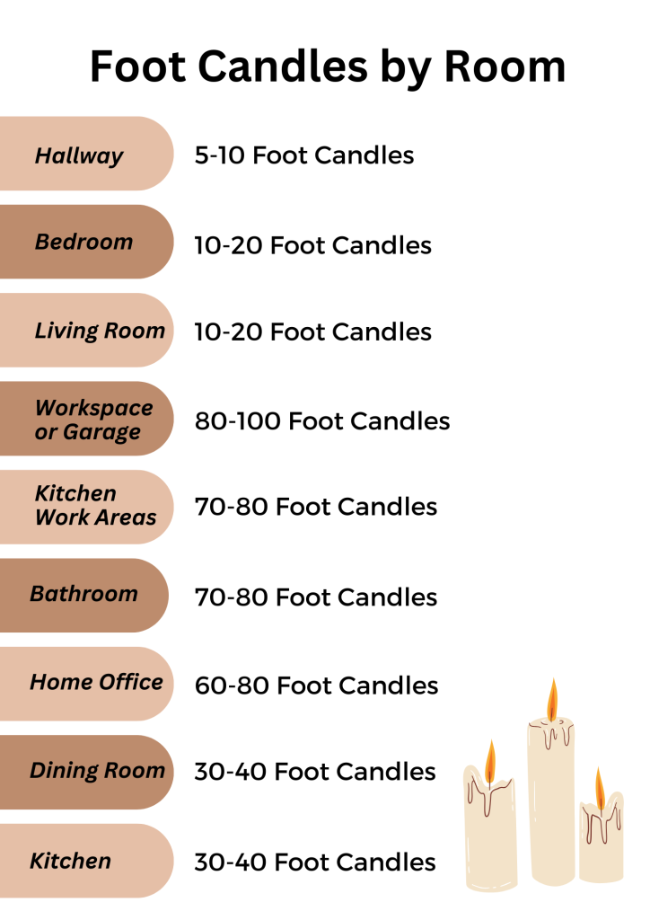
Designing a home that will stand the test of time is an opportunity to create something that will last – beyond fleeting trends, changing styles, and ever-evolving tastes. It involves thoughtful consideration of how each element contributes to the whole design! By choosing simple, elegant, and balanced pieces, you can create a room that will be a sanctuary apart from the whims of a world in perpetual motion.

Keep It Simple

Embracing simplicity is the key to a home that will survive the passing trends. Sticking to the basics will ensure your design won’t be outdated as soon as you finish it! Pick classic patterns, a neutral color palette, and stick to finishes that will pass the test of time. Remember, less is more in a timeless home!

Use a Neutral Color Palette

Neutrals provide a base that will complement the trends of any era. Choosing a neutral color palette is the safest bet if you don’t want to frequently repaint or re-furnish your home, but still want to keep it looking fresh and up-to-date! 

This does not mean you have to go beige head to toe – if you’re a color-lover, consider adding bright elements in the artwork and other easily-replaceable accessories like pillows, rugs, lamps, drapes, etc. Then it’s an easy swap when you’re ready for a style change!

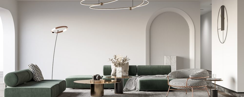
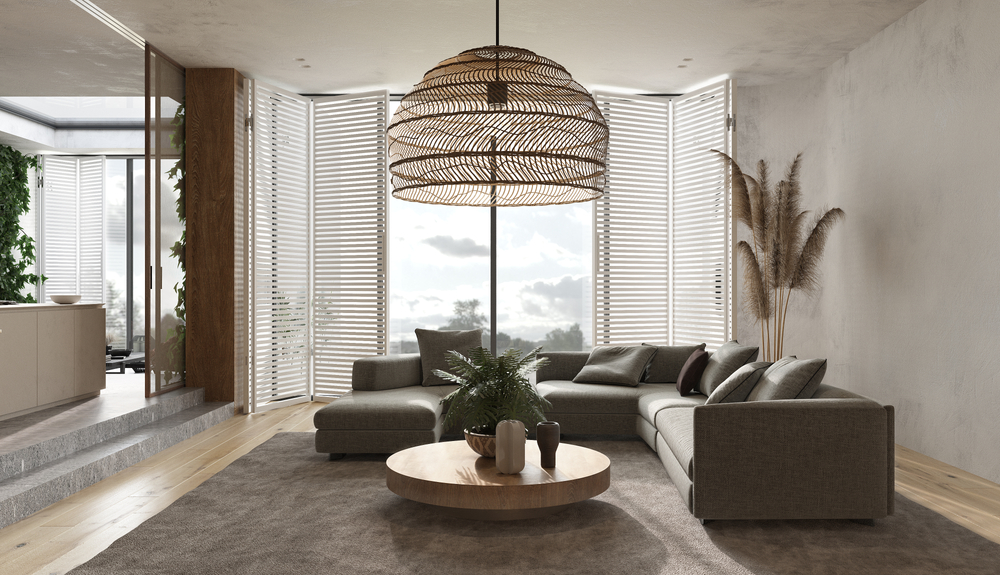
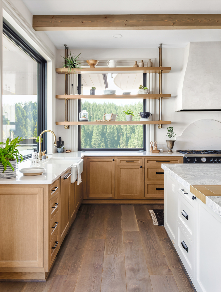
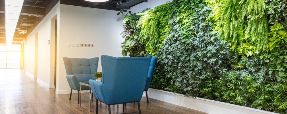
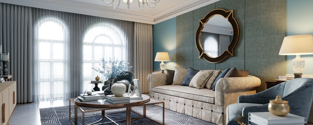
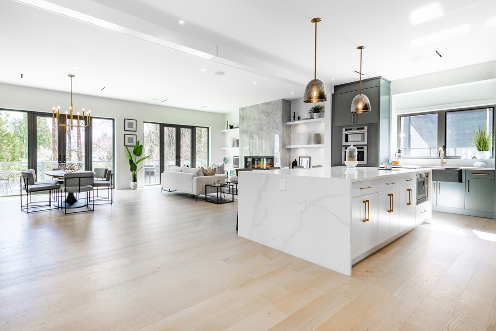
This home’s neutral color palette is sure to withstand any style changes that are thrown at it! From floor to ceiling, this space speaks elegance. The houseplants add a pop of life and color, and there’s plenty of room to add more personal touches. We love the way the table lamp mirrors the arched windows and adds interest with a metallic bronze finish. Lamps are a smart way to add a touch of trendy because they’re easy to move to a different location or replace as styles evolve!

Stick to Classic Patterns

Some patterns belong in the past while others seem to persist through the generations! When you’re adding visual interest, pick classic patterns instead of the current trends. Florals, stripes, damask, and some plaids are generally a safe choice.

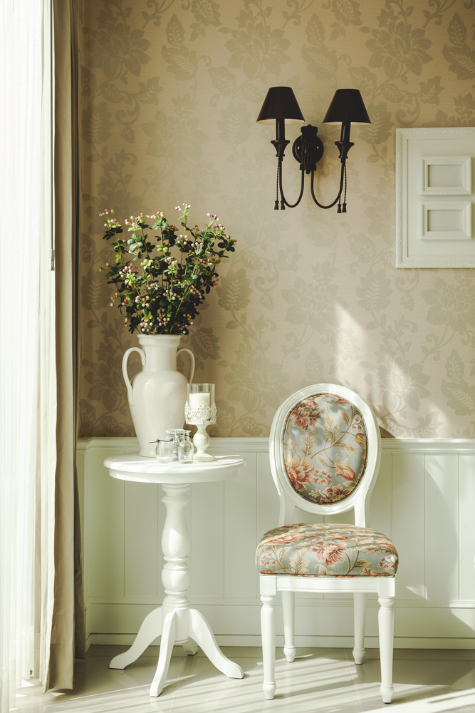
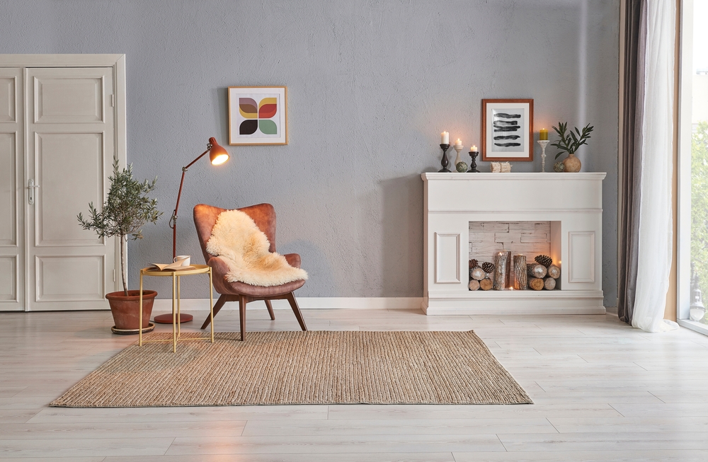
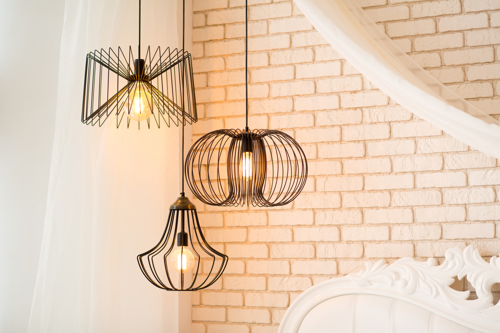
This nook exudes a vintage feel without any out-of-date vibes. The floral patterns on the chair and wallpaper have been proven through the generations – they’re here to stay! We also love a lamp-shaded wall sconce like this one. Choosing a traditional shape means that even if you change out the furniture and/or accessories, your light fixture can still look fresh.

Finish Up With Finishes

When you’re designing a timeless home, lighting finishes can either bring your design into the current era (but may need to be replaced before long) or they can be an element that endures. Choosing the wrong finish can detract from the ultimate purpose of the design: transcending fads and remaining appealing throughout the years.

This home is ageless, but has elements to bring it into the present. The open space makes it a blank canvas to work with any design era. The gold hardware and light fixtures speak to the current trends and modernize the space. Even in a timeless design, it’s important to pick a few things you love – even if they might need to be replaced later. If you’re looking for something that will last, opt for crystal, nickel, or another classic finish.

Pro Tip: It’s also important to consider the style of your home. For example, ornate cabinet knobs may feel trendy in a sleek, modern kitchen, but will feel timeless in a historic home.

Use Natural Materials

Throughout every style era, the timelessness of nature continues to inspire beautiful designs. Whether it’s in the home’s architecture (wood accents, stone details, or tiles) or in the accessories (indoor plants, ceramics, and other accessories), natural elements will inevitably show up somewhere in every home. Finding ways to include natural materials in your home will keep your design current and beautiful for years to come!

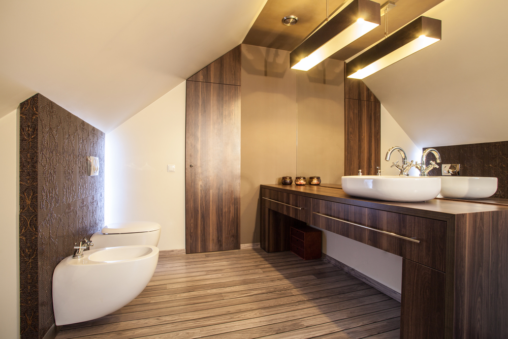
This bathroom’s repeated warm wood accents tie this design together seamlessly. From the dresser to the vanity, the room feels cohesive and ageless. We always love a pendant vanity light, but we especially love this one for a timeless look! Its classic shape and color are bound to blend in with any trend – just change out a few of the countertop accessories and you’ll have a brand-new design without spending a fortune. 

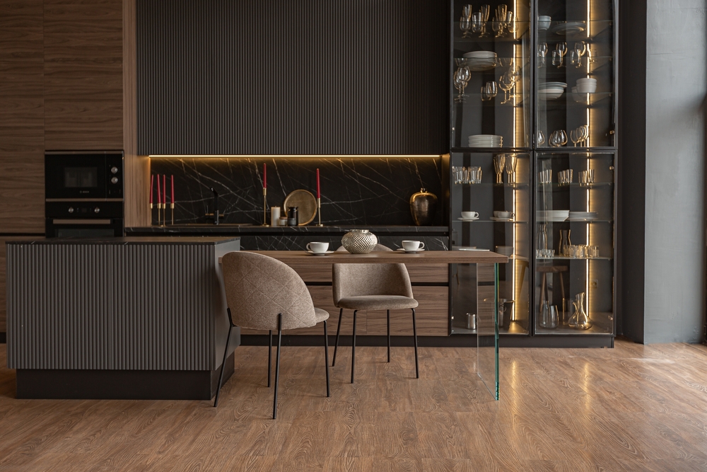
Quality Over Quantity

When you’re wanting a design that lasts, durability has to be a big consideration. Investing in quality fixtures and furniture will bring you the peace of mind that comes from knowing you won’t need to spend more money later on repairs or replacements. Focus your efforts on building a core collection that will last, then you’ll have the time and budget to indulge in a trend here and there as you find things you love.

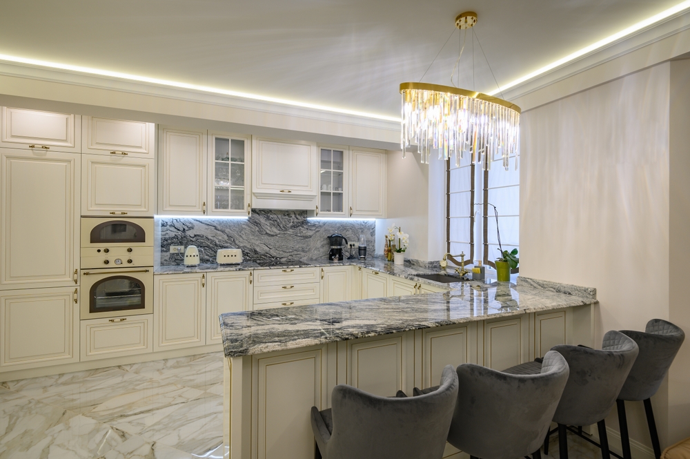
This kitchen is the perfect example of how a light fixture can completely transform a space! This white and grey kitchen needed a focal point, and this fixture delivers! The design of the fixture is classic take on crystal chandeliers, and it’ll last beyond trend shifts. Choosing a quality, classic light that makes you happy is a great way to ensure that you’ll love your lighting through the trends for years to come.

Focus on Functionality

A well-designed space that serves the people living there is more likely to remain relevant over time and can adapt to changing circumstances. Unlike trends that come and go, functional design focuses on design principles that transcend temporary styles..

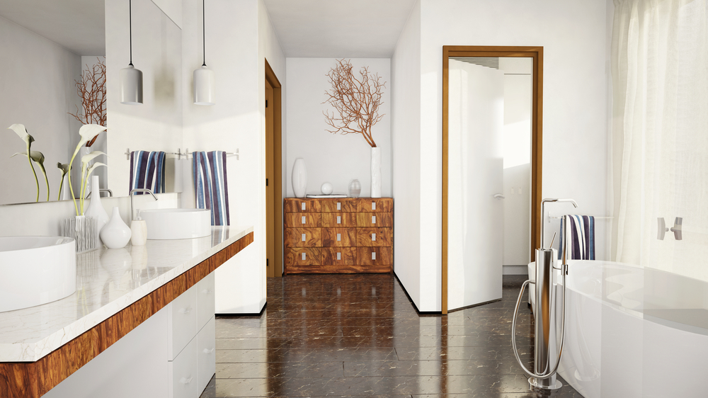
Even the most gorgeous bathroom will feel outdated if usability isn’t considered first. A bathroom is one of the most vital rooms in the house, so it should be functional! It’s where you care for yourself and ensure you’re at your best. 

This stunning bathroom takes functionality to the next level, and maximizes a space with difficult proportions. This awkward space feels bright and open thanks to a focus on functional design. Placing the toilet under the low part of the ceiling maximizes the functionality of an otherwise unusable space. The vanity’s open design helps to make the room feel bigger, and it still packs plenty of storage with a pair of wide drawers. 

The light in this room has been cleverly layered with a functional and beautiful fixture over the vanity, and accent lighting behind the wooden panel that helps trick the eye into thinking the space is larger than it is. Taking the mirror all the way up and over maximizes usable mirror space (no more fighting for face time) while also reflecting the light and making the space feel larger. With it all put together, this angled ceiling feels more like a design feature rather than a space-stealer. 

Incorporate Your Style

No matter the room, the impact of the design will fall flat if you fail to add some personal touches! This isn’t simply a space to be lived in for years – it’s also a home to make memories in and find joy in. Build a base that will transcend trends, then mindfully select more modern pieces, knowing that you may want to update them throughout the years to maintain relevance.

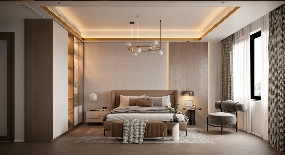
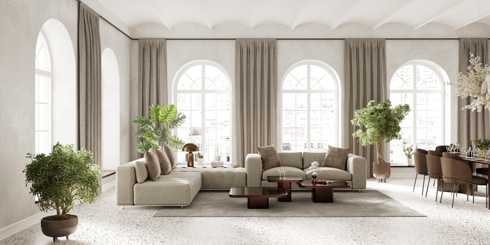
This space is the perfect example of building a timeless base, then adding personal touches. The neutral colors and clean lines of the furniture, floors, and built-ins speak to timelessness, but the light fixtures are modern and on trend. Lamps and pendants (or just the shades) are fairly simple to replace, but without them this design wouldn’t be complete! 

The personal touches here are to die for. We love how this asymmetrical design uses different nightstands and lights, but still manages to maintain cohesiveness. Also peep all the accent lighting in this room – from the ceiling and walls to the built-ins, the lighting in this space packs a punch!

—

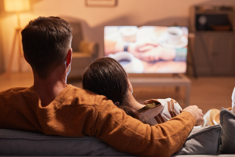
When you put love and effort into a space, you’ll want to enjoy it with your loved ones for many years to come. From impromptu living room dances to enjoying meals together, your focus should be on each other – not the outdated design of your home! Our experts are ready to help you create a classic home that will still be true to you and your taste. Give Illuminations a call to get started!

Filed Under: 2024

Kitchen Inspiration: 7 Stunning Spaces Worth Copying in Your Home

Kitchen Inspiration: 7 Stunning Spaces Worth Copying in Your Home

by admin · Dec 31, 2024

Beyond its functional role in cooking and entertaining, the kitchen is where memories are made and lasting bonds are created. If you find yourself glancing at your kitchen and sensing it needs a refresh, you’re not alone! Getting started can seem like a daunting task to undertake, but with some inspiration from these curated spaces and expert insights, you can transform your kitchen into a space you genuinely love. From sleek and modern to charming rustic kitchens, each of these spaces is begging to be replicated in your home and infused with your personal style. It’s time to breathe new life into your kitchen!

Moody Modern

Dressed in sophistication, this kitchen features dark marble backsplashes, gorgeous wood accents, and thoughtfully styled glass floor-to-ceiling cabinets. This space deserves lighting that highlights every square inch. The under-cabinet lighting and strip lighting in the glass cabinets create a moody ambiance with dramatic shadows and highlights that will have guests’ jaws on the floor the minute they step into this kitchen.

Cozy Corner

The contrast of the stark white against the warm earthy wood in this kitchen is enough to make anyone green with envy (like this daring backsplash)! The light and shadow of the sunlight brings beautiful dimension during the day, and when the sun sinks low, this trio of pendants takes center stage, bringing just the right amount of light to make this cozy kitchen corner glow.

Teal-Accented

This kitchen’s not short on space, but this clever play with colors makes the room feel even bigger. The color from the cabinets is carried seamlessly across the ceiling, creating the illusion of extra room height, and the white upper cabinets gracefully recede, creating the appearance of a wider space. The herringbone floors and luxurious marbled countertop and backsplash add layers of texture, personality, and warmth, and to crown it all, a stunning globe chandelier serves as the pièce de résistance, tying each element together into a harmonious display of creativity. Our love for this kitchen knows no bounds—it’s a masterclass in design ingenuity!

Charming Cottagecore

This kitchen is giving irresistible countryside cottage charm! The neutral color palette places the spotlight on the beautiful textures covering the backsplash, wood, and walls. The careful styling also pulls out all the stops, transforming this space into a haven perfect for late-night intimate conversations. Picturing a midnight snack beneath the glow of these pretty white pendants is nothing short of a dream!

Linear Kitchen

Clean lines give this kitchen a modern and industrial look where the natural beauty of the materials shines through. Every element – from the sleek cabinetry to the stone floor to the gorgeous linear light fixtures – contributes to a streamlined environment where form seamlessly meets function. In embracing clean lines, this kitchen stands as a testament to the timeless appeal of modern design, where simplicity becomes the ultimate sophistication.

Light and Airy

In this Scandinavian-style kitchen, light natural wood, subtle linear accents, and the inclusion of cozy chairs create an atmosphere that seamlessly marries modern design aesthetics with a warm, inviting aura. The light color palette brings airiness that feels both fresh and timeless while the linear accents (such as the backsplash and light fixture) bring order and simplicity. Adding cozy elements like the chairs brings a sense of hygge – a term embodying coziness and contentment – to the design, inviting guests and loved ones to come together and create lasting memories.

Monochromatic Kitchen

This small kitchen embraces the power of a monochromatic color palette where texture and scale are the unsung heroes. It proves that with a little creativity, gorgeous style is possible in any space! The ingenious globe wall sconce serves as a focal point that adds a touch of personality and is the perfect lighting solution for this small kitchen. By carefully selecting the right size features, every inch of the space was maximized for functionality and gorgeous aesthetics. Thoughtful design makes all the difference!

—

These seven kitchens not only showcase the transformative power of design but also emphasize that thoughtful choices can give you a kitchen that has it all – functionality and beautiful aesthetics. There are so many possibilities for a kitchen where creativity and connection thrive! Whether you lean towards the cozy charm of rustic aesthetics, the simplicity of a Scandinavian style, or a sleek and modern space, these kitchens prove that the heart of your home can be a reflection of your unique style and personality, and none of it could be possible without great lighting. Give Illuminations a call when you’re ready to create a space that truly feels like the heart of your home!

Filed Under: 2024

How to Boost Your Mood with Better Lighting

How to Boost Your Mood with Better Lighting

by admin · Dec 24, 2024

Have you ever noticed how the lighting in a room can instantly influence your mood? The cozy, soft glow at an intimate candlelit dinner. The bright, energizing lights in a busy office or retail store. The warm, intense sunlight at a photographer’s golden hour photo shoot. The dust-specked bluish beam of light coming through your window on a cloudy day. 

Light plays a big role in shaping our emotions, mood, productivity, and well-being. In this article, we’ll explore more about how lighting and mood are related, and how you can use light to feel your absolute best.

Feeling Tired? The Science of Light and Sleep

Imagine waking up to a vivid sunrise, feeling invigorated, motivated, and ready to conquer the day. This comes from light’s impact on our internal body clock, known as the circadian rhythm. The natural light we are exposed to during the day helps regulate our sleep-wake patterns and, in turn, our mood and energy levels. In the mornings, sunlight has a cool, almost bluish hue. At midday, sunlight is a truer white. In the evenings, sunlight has warm, almost orange hue. This transition from cool to warm throughout the day is hardwired into our brains – and helps our body know when its time to wake up, and when it’s time to get ready for bed.

Artificial lighting, if properly aligned with our circadian rhythms, can mimic the many benefits of natural light. This is important since the majority of us spend much of our waking hours indoors under various types of artificial light. The most important thing to remember if you want a good night’s sleep, is to avoid light sources that give off cool, blue light for a couple of hours before bed. This “morning” light will trick your brain, and inhibit melatonin production making it harder to get to sleep. Use light bulbs with warmer light in your bedroom, and turn off the screens (phones and tvs give off blue light too!). Nothing boosts your mood faster than a good night’s sleep!

Feeling Down? The Science of Lighting and Mood

Sunlight is the gold standard for lighting. Natural sunlight influences mood by releasing and regulating different hormones and chemicals in our bodies, including melatonin and serotonin. Maximizing exposure to natural light in your living and work spaces is proven to have a positive impact on your mood. Studies have shown a strong link between exposure to sunlight and a boosted mood. Exposure to bright, natural, or natural-like lighting is linked to reduced symptoms of depression and improved mood. While sunlight isn’t necessarily a cure for low mood – making time to be in it can certainly help you to feel a little less down, especially during those darker winter months that can trigger seasonal depression. 

Natural lighting isn’t always available, of course, and this is where artificial light comes in to save the day! Just as the temperature of light can affect your sleep cycle, it also plays a part in your mood and the emotions you feel. Warm light (yellow and orange hues) creates a cozy, inviting atmosphere and increases relaxation and comfort. Cool light (bluish tones) is energizing and can promote focus and alertness. Generally, the goal is to balance warm and cool lighting to cater to different settings and activities.

How to Choose the Right Light:

Lighting at Home

Lighting in your home is about more than just practicality. Lighting helps you create a space that is welcoming and supports your emotional well-being. Your home is your safe space and your sanctuary. Soft, warm lighting in living spaces and bedrooms creates a sense of relaxation and tranquility. Dimming lights in the evening can tell the body to unwind, supporting better sleep. In contrast, bright, cool lights are incredibly helpful in areas where you need to stay focused and alert, like a kitchen food prep counter, a garage workshop, or a home office. 

In multi-use spaces, it’s especially important to layer your light. For example, a large great room with layered light could have cool white recessed lights in the ceiling on a dimmer switch, a large window with blinds for natural light, and lamps placed in strategic areas with warmer bulbs. By adjusting light levels and sources, you’ll be able to create a mix that feels right for any activity, and transition seamlessly from homework at the kitchen table to a movie night in the living room. 

In outdoor areas, like a patio or yard, opt for warm lights to create a comfortable, cozy atmosphere for your late-night BBQs. Cool lights work well for security lights, or for areas where you need to see clearly to be safe, like stairs or a walking path with uneven levels, a basketball court, grilling area, or storage shed. Whenever possible, choose fixtures that direct light downward to prevent light pollution – the best night lights around are the stars! 

Pro Tip: You may want to consider investing in smart LED bulbs. While they cost more upfront, they are incredibly energy efficient (meaning a lower power bill), and many can be either manually adjusted or programmed on a timer to go from cool to warm light throughout the day.

Lighting at Work

As a general rule, bright, cool lighting in workplaces can improve productivity and concentration. Research suggests that daylight-like lighting in office settings enhances job satisfaction and reduces fatigue. In addition, incorporating warm lighting in break areas can reduce stress by creating a more relaxing space for employees. Always remember to keep your employee’s needs in mind, and whenever possible ask for feedback. For example, fluorescent lighting ticks the boxes for bright and cool, but it can also cause headaches. An office workspace in a high-stress industry might do well with cool light (to boost productivity) OR warm light (to ease stress levels), depending on the needs of the people that will be in that space.

If you work from home, the same principles can be applied to your home office. Make sure your office has plenty of cool, bright light for those days when you need to be laser focused. Add in a warmer light source like a desk lamp for stressful days or late-night work marathons.

Pro Tip: Another proven mood-booster in the workspace is the addition of plants. Find varieties that will flourish with the lighting conditions in your space, and add a few around the office.

Creating Your Ideal Lighting Environment:

  • Know Your Needs – Figure out the main purpose of each space, and determine how you need to feel while you’re there. Tailor the lighting accordingly to ensure the space will meet your mental and emotional needs while you complete tasks in the area.
  • Choose the Right Bulbs – Light bulb tech has come a long way. Choose bulbs with color temperatures that match your goals, or invest in smart lighting systems that allow you to change your lighting settings throughout the day as your needs change. Remember to be flexible, you might end up trying a couple different light temperatures before you find the best one. 
  • Use Dimmers and Controls –  Whenever possible, install dimmers to control the intensity of your lighting. Adjusting the lighting levels can help you create the desired ambiance for any occasion and “set the mood” to help improve your mood!  
  • Maximize Natural Light –  Arrange your furniture and decor to maximize natural light exposure. If you have limited window space, light-colored walls and furniture or wall art with reflective surfaces can help to bounce that coveted natural light around your rooms.

————-

The connection between lighting and mood is an interesting mix of science and psychology. Whether it’s nurturing warm hues or energizing cool tones, the quality and type of light in our surroundings truly affects our mood and emotions. With the right information in hand, you can thoughtfully create spaces that elevate, rejuvenate, relax, and inspire. So, next time you turn on a light, remember that you’re not just lighting up a room – you’re boosting your mood too!

———–

Need more bright ideas for the lighting in your home? Contact us today to chat with an expert! 

Filed Under: 2024

Scale and Proportion 101: How to Avoid 4 of the Most Common Mistakes and What to Do Instead

Scale and Proportion 101: How to Avoid 4 of the Most Common Mistakes and What to Do Instead

by admin · Dec 17, 2024

Have you ever stepped into a room and immediately sensed something felt weird… but couldn’t quite put your finger on it? Without proper scale and proportion, a room’s design can crumble quickly, and leave it feeling… off. If you want to get it right, you need to learn how to balance the objects in your room with each other and the room itself.

Scale vs. Proportion

Scale refers to the size of objects in relation to the room, or how well they seem to fit together in the space. Proportion is the relationship between items, or how well they seem to fit with each other. In order to get it right you need both – the things in your home need to look right with each other and with the room itself. 

Having a home that looks balanced is easier said than done, so we have some expert tips to help you avoid some of the most common mistakes and create a home where everything works together in harmony.

Mistake #1: Choosing the Wrong Size Rug

One of the most common mistakes is choosing the wrong rug size. Rugs can be a significant investment, and novice designers might be tempted to cut costs by going with a smaller size – but don’t fall into this trap! A too-small rug can make your room feel cramped. On the other hand, a too-large rug can leave edges in awkward places and feel bulky. The right size will balance with your furniture and your room. 

Rug placement and size needs will be different in every room, so following a rug guide like this can steer you in the right direction. For example, in the living room a good rule of thumb is to select a rug that’s large enough to either accommodate all the furniture completely on top of it or have only the front two legs of each furniture piece placed on it. 

Why This Doesn’t Work: The rug and furniture chosen are noticeably undersized for the space! Relying on a floating rug island with a single chair and side table to carry the design is ineffective (and a trip hazard). To achieve balance, this room needs more furniture. You’d either need to choose seating that matches the scale of this rug to create a small conversation area, or use a larger rug to anchor larger furniture to fill the room.

What to Do Instead: We cannot emphasize this point enough: selecting the right size rug is everything! This gorgeously balanced room proves it’s worth it. This large living room has plenty of furniture, and a large rug like this provides an essential foundation that anchors the space and ties the room together. In any room, a well-fitted rug will ground the space, making it feel cohesive. 

Mistake #2: Not Enough Light

Another common mistake is to use lighting that’s mismatched with scale of the room or in proportion to the furniture. Yes, scale and proportion matter in lighting too! Lighting that is too dim or overpowering can really mess up the feel and functionality of a space. 

The key is layering your light – using various sources and types of light throughout the room to give a well-balanced light throughout the space by addressing common issues like dark corners and poorly lit work areas. A well-chosen array of light fixtures will make your home look like a designer’s been through, but how do you know how exactly much light is right for your space?

To determine your lighting needs, first you’ll have to understand a few basic light measurements. Lumens are a measurement of the amount of light emitted by a light source. A foot candle is a measurement that describes how bright a light source appears to be from one foot away. You’ll need to use both of these to calculate your lighting needs!

Larger rooms need more light than smaller rooms, and task-oriented spaces within those spaces (like a kitchen counter, office desk, or reading chair) will need more light than the rest of the room. To get an idea of how much light you’ll need, start by measuring the width and length of the room, then multiply those two numbers to find the room’s square footage. Next, use the chart below to determine how many foot candles your room or space will need. 

The last step is to multiply your room’s square footage by the recommended foot candle requirement to determine the number of lumens your space requires. Most modern light bulbs have their corresponding lumens included on the packaging. Simply add up the lumens for each bulb in your room to see if you’re in the right range. 

Example: A 20’x20’ living room has 400 square feet. The recommended foot candles for living rooms is 10-20. 400 x 10 = 4,000 and 400 x 20 = 8,000. In this room, you would want to add up the lumens for your light bulbs and shoot for somewhere between 4,000 – 8,000 lumens for the entire space.  

Keep in mind that this recommendation is for typical use. You also need to take into account all of the ways you’ll use the room, and plan balanced lighting for each situation. If the living room above was also used for movie nights and has a home office in the corner, you would need a way to accommodate those activities too. You’ll need fewer lumens for movies (dimmer switches or small lamps are a great option) and extra light for work (a desk lamp, extra overhead light, or wall sconce would work well). 

Remember, these numbers are general recommendations. In addition to being balanced, your lighting also needs to be comfortable. Start with the recommendations, then tailor your lighting from there to get what works best for you.

Why This Doesn’t Work: These small lamps are undersized for the scale of the bed and the room, which is both an aesthetic and a practical issue – nobody likes squinting at their late-night read or tripping over the black shoes on the floor in the middle of the night. 

What to Do Instead: Using a variety of light sources ensures sufficient light coverage and adds depth, enhancing the room’s overall atmosphere. In this particular space, the lamp, pendant, chandelier, and accent lighting have been thoughtfully chosen to provide just the right amount of light and are in perfect proportion with the room’s other features. Whether you’ll be using the space for a late-night book or preparing to take on your day, this room promises to exceed your expectations functionally and aesthetically.

Mistake #3: Picking the Wrong Size Chandelier or Pendant

In addition to getting the amount of light right in your space, it’s also important to get a fixture that’s to scale. Since chandeliers and pendants typically serve as a room’s focal point, it’s especially important to get it right! To avoid picking the wrong size, a few tips:

  1. Measure your room’s width and length in feet, then add those two numbers together to determine the width of your chandelier or pendant in inches. For example, if your room is 10 feet x 16 feet, your chandelier or pendant should be around 26 inches wide (except in a dining room – no head bumps please!).
  2. Measure your room’s height. We recommend adding 3 inches of height to your fixture for every foot of space between your floor and ceiling. For example, if your ceilings are 10 feet tall, your chandelier or pendant should be around 30 inches tall.

Why This Doesn’t Work: We can understand why this room doesn’t have a chandelier with those gorgeous windows as a focal point. But in the evenings, this room’s focal point will disappear into the shadows and the high vaulted space above will feel empty. A chandelier would fill this void and give this room a gorgeous 24/7 focal point. It would also provide essential lighting for the evening hours and create a cozier, more intimate atmosphere than a grid of bright recessed lights.

What To Do Instead: Use the guidelines above to find the ideal fixture size for your space. In this room, the pendant is slightly oversized, but it’s okay to make judgment calls when deciding what’s going to work best in your space since you’re the one who has to live with it! In this room, the pendant serves as the focal point and creates a more intimate conversation area. By occupying the vertical space, it brings harmony and balance to the design. If you need extra help selecting the correct size fixture or installing it, don’t be afraid to ask an expert!

Mistake #4: Small Wall Hangings on a Large Wall

We love how art and other wall hangings add personality to a space, but we often notice inexperienced designers or homeowners creating a tiny island of art in a sea of empty wall space. It’s a common mistake, but is one that is easily avoidable with a few essential tips!

When it comes to hanging pictures on a large wall, you generally have two options: creating a gallery wall or opting for a larger piece of art. Whichever you decide on, the resulting arrangement or artwork should be around 60-75% of the width of the furniture it’s above and take up 60-75% of the wall height above it for a perfectly balanced look! If you’re using multiple pieces, space them out to get the right scale. Don’t be afraid to experiment with different layouts and art pieces – you may be surprised by what combinations work.

Why This Doesn’t Work: The frames above this bed are too small, throwing off the whole balance of the room. Luckily, the solution to this problem is simple!  You can either keep the existing frames and incorporate more pieces for a gallery wall or replace them with something larger. Whichever you choose to do, getting the scale right is a non-negotiable!

What To Do Instead: The art in this room is a much better size for the room and the bed! While it might be a touch more than 60-75% of the bed’s width, it’s spaced appropriately and doesn’t hang so high that you’ll need a stepladder to see it. The result is a gorgeous room with perfect proportions and scale. Hanging the right art in the right place is critical to a design that drops jaws.

Mistake #5: Not Styling with Scale in Mind

If we could give one tip to aspiring homeowners/designers it would be this: details are everything. To achieve a beautifully designed room, you need to pay attention to both scale and proportion when it comes to accessorizing. 

When curating pieces to display in your room, some basic principles apply. First, create little moments by using your decor in groups! For example, pair a small vase with some books and a frame. Most designers say that groups look better in odd numbers, so shoot for 3 or 5 rather than 2 or 4. Second, stagger the heights and sizes of the objects in a group. Playing with proportions can help you to get a design that’s both balanced and visually interesting. Last, use a variety of colors, materials, and patterns to keep things interesting and achieve the perfect balance!

Why This Doesn’t Work: While this kitchen is full of vibrant personality and patterns, the overall effect is a tad overwhelming and disorganized. The island feels slightly overrun with a bunch of small items similar in size (although the flowers at the end do add some much-needed height). The top shelf is unbalanced and half empty, while the bottom shelf is stuffed with a row of, again, similarly-sized items. In both places, creating groups with space would give the decor a bit of room to breathe, and give each design moment a chance to shine.

What To Do Instead: This room beautifully showcases the result of investing time in thoughtful styling! Items on the counter are grouped to the edges, leaving plenty of work space. Items on the shelves are spaced out to fill the shelves without blocking the light, a must for this stunning storage solution that maximizes shelf space without sacrificing the view. Even the large shelving feels unobtrusive because it’s to scale with the rest of the room. While this kitchen has a more minimalist vibe, paying attention to scale and proportion can give you a balanced look with any style from a traditional living room to a maximalist bedroom. 

—

Understanding scale and proportion is essential for making design choices that lead to a balanced and harmonious home. Whether choosing the correct size rug to ground a room, selecting a beautiful light fixture, hanging wall art with precision, or curating decorative pieces thoughtfully, every detail matters. By avoiding these four common mistakes and following our tips, you can transform your home into a space that’s the perfect blend of form and function. For more personalized advice, call Illuminations! Our experts would love to answer your questions and help you as you design a home you love.

Filed Under: 2024

A Homeowners Guide to Standard Lighting Measurements and Guidelines

A Homeowners Guide to Standard Lighting Measurements and Guidelines

by admin · Dec 10, 2024

If you’re building, renovating, or just ready for a change in lighting, there’s nothing worse than spending hours researching and choosing a light fixture, only to get it home and find out that a measurement got missed somewhere along the way and it won’t work the way you wanted.

Before you buy, read and bookmark this article for quick reference. When you’re armed with the best information, you’ll make the best choices. 

And remember, the very best way to get your information right from the get-go is to ask a lighting expert – so don’t skip the trip to your local lighting showroom! They’ll be able to help you avoid any common mistakes and help you get what you want right from the start.

Understanding Light Output

You’ll want to get familiar with a couple of vocab words before jumping in. 

  • Watts: The amount of energy or electricity a bulb uses. Has nothing to do with brightness.
  • Foot Candles: The amount of perceivable light from a fixture at one foot away.
  • Lumens: The amount of overall light given off by a light source. Has nothing to do with power consumption.
How These Terms Relate To Each Other

Comparing a fixture or bulb’s wattage and lumens will show its efficiency. A bulb with low wattage and high lumens uses less power to generate more light, meaning it will cost less to light your home. 

Not all rooms are created equal – bedrooms generally need less light than a kitchen. To determine how many lumens you need, multiply the square footage of the space by the foot candle recommendation. For example, a typical 300 sqft bedroom will need around 3000-6000 lumens in total. [Sqft of room x min and max foot candles = Total min and max lumens needed]

This total includes all types of light in the room, from ceiling fixtures to lamps to sunlight. For best results, you never want to have all of the light in a room come from a single source. A great lighting plan considers the times of day the room will be used, accent lighting like reading lamps, and activities that happen in the room. If your room can transition perfectly from busy daytime work to a relaxed evening at home, then you’ve nailed it.   


Universal Standard Measurements

While most fixtures have their own set of standard measurements for placement and sizing, there are a handful of things that are universal. For brevity’s sake, we’ve put those things here rather than repeating them for each fixture. 

  • Height and Head Clearance: Keep at least 7’ of clearance between the bottom of the fixture and the floor. If there is any chance that a hanging fixture could be in the way, especially in places like hallways and stairs, raise the fixture a bit more to avoid accidents. Vaulted or high ceilings may need more clearance between the fixture and the floor to look balanced. Lower fixtures will make a room feel more intimate, while higher fixtures are less noticeable (which is sometimes the goal).
  • Door Clearance: If you’re installing a fixture near a door, keep 6” of clearance between the bottom of the fixture and the top of the door.
  • Weight Limit: Modern standard ceiling light boxes are manufactured to hold up to 50 pounds when installed correctly. It’s important to check the weight of your fixture and the structure of your ceiling before installing any ceiling fan or a fixture over 35 pounds. Installing the extra support doesn’t usually cost much – and it’s way cheaper than paying for damages if an improperly supported fixture falls.
  • Dining Table: The max width of a light fixture over a dining table should be around 1/2-3/4 the width of the table. The bottom of the fixture should be just above your seated eye level so that it doesn’t obstruct the view – usually about 30-36” from the table surface. Always center the fixture over the table, not in the center of the room. [table width x ½ and ¾ = min and max fixture width]
  • Great Rooms and Multi-Purpose Rooms: You’ll want to consider all angles when choosing fixtures for rooms with multiple uses. For example, many great rooms have a dining room between the kitchen and living room. You’ll still want to follow standard dining fixture recommendations to start – but you’ll also need to hang your fixture high enough to avoid glare and an obstructed view while standing and using the rest of the space.

Standard Measurements by Fixture

Standard measurements will work well in almost every home, but there’s always room to bend the rules a little for a fixture you love or in a unique space. For rooms or areas not mentioned, refer to the general standards and/or rooms with similar uses.

FLUSH AND SEMI-FLUSH LIGHTS

  • General Sizing: Add the length and width of the room in feet together, then record that number in inches to determine the best width for a ceiling fixture. For example, a 10’x20’ living room can accommodate a 30” wide ceiling fixture. (This formula works well for most ceiling-mounted lights, not including fixtures like ceiling fans and recessed lights.) [room length in feet + room width in feet = optimal ambient fixture width in inches (no conversion, just change the units)]
  • General Placement: Flush and semi-flush lights are generally installed in the center of a room, or over the center of a specific-use area like a dining table. Flush mounts work best in rooms with standard ceiling heights at 8’, and may feel dim if installed on a tall ceiling. Semi-flush lights hang down from the ceiling, and work great in rooms with 9-10’ ceilings. 
  • Bathroom: It’s best to maintain 8’ between the top of the bathtub and the bottom of a fixture. Flush mounts are a great choice for ambient lighting in a bathroom, but they don’t work well as the only light in a bathroom, as they can create shadows on the face. For best use in the bathroom, combine your ceiling fixture with a pendant or sconce near the mirror.

PENDANTS 

  • General Sizing: For single pendants, the same room length in feet + room width in feet = fixture width in inches formula from above works well. For grouped pendants, sizing depends largely on personal preference and the available space for installation. 
  • General Spacing: When hanging multiple pendants, the minimum spacing between them should be about 18”. For larger pendants, the recommended minimum spacing is equal to the diameter of the pendants. For example, 20” wide pendants should be hung at a minimum of 20” apart.
  • Kitchen Island: There are many ways to hang pendants over an island, and there isn’t one hard-and-fast set of rules. Here are a few guidelines to consider:
    • For islands up to 6’ wide, the max is usually two pendants, but you can sometimes get away with three small pendants if you prefer that look. For islands over 6’ wide, many homeowners choose to use three or more pendants to maximize light coverage across the countertop.
    • To determine how far away from the edge of the island pendants should be, divide the diameter of the pendant in half. For example, the side of 18” pendants should be a minimum of  9” away from the edge of the island. [pendant width / 2 = recommended distance from pendant to edge of island]
    • A large, single pendant should not exceed 2/3 of the island’s width. For example, the widest you’d want to go on a pendant over a 6’ island is about 48”. [total island width x ⅔ = max pendant width]
  • Sinks and Counters: The standard distance from the counter for a pendant is 30-40” but 36” and above is best. When using pendants for task lighting, choose a fixture that allows the light to shine in the right place – a pendant with a solid bottom won’t light a counter very well.
  • Bedroom: As a reading light above a bedside table, aim for the lighted portion of the pendant to be about 55-60” above the floor or 30-36” above the mattress. 

CHANDELIERS

  • General Sizing: To determine the ideal diameter, add the length and width of your room together in inches. For example, a 15×20 room would need a chandelier approximately 35” in diameter (15+20=35). To determine the ideal height of the fixture, plan on around 2-3” of height for each foot of ceiling height. For example, in a home with 8’ ceilings, a chandelier should be about 16-24” tall (8×2=16, 8×3=24). A two-story foyer in that home can easily support a chandelier that’s 32-48” tall (16×2=32, 16×3=48). [room length in feet + room width in feet = optimal chandelier width in inches (no conversion, just change the units)], [ceiling height in feet x 2 and 3 = min and max chandelier height]
  • General Placement: Chandeliers are a bold design choice intended to stand out and make a statement. They’re almost always placed in the center of a room, or centered over a part of a room with a specific use, like a dining table or a clawfoot bathtub.
  • Dining Table: In a room with 8’ ceilings, the standard height is about 30-36” above the table, then add 3” for every foot over 8’ in ceiling height. Always center the chandelier over the table, not in the center of the room.
  • Two-story foyer: Keep the bottom of the chandelier above the height of the first floor.

SCONCES

  • General Sizing: When it comes to sizing and scale, there isn’t a great universal formula here – it’s left largely up to personal preference and a good eye. A good rule of thumb for sconces is this: The closer you’ll be standing to look at whatever the sconce is lighting, the smaller the sconce should be. 
  • General Placement: Sconces are usually placed around eye level, around 60-72” from the floor. In rooms with higher ceilings, 66-72” will feel more balanced. Take into consideration the style of the fixture – a sconce with a bare bulb will feel more comfortable a bit above eye level, whereas a sconce with a shade will feel more comfortable if the shade is at eye level to avoid catching the glare of the bulb from under or above the shade.
  • Dining Room: Because people will be seated for the majority of the time, sconces should be hung slightly lower in the dining room – closer to 60” from the floor.
  • Bathroom: Sconces work best placed on either side of the mirror at eye level, around 4-12” away from the edges depending on the look you’re after and where the electrical boxes can be installed. Sconces can also be centered above the mirror at just above eye level, usually between 60-70” off the floor. 
  • Bedroom: As a reading light above a bedside table, aim for about 55-60” above the floor or 30-36” above the mattress. 
  • Porch, Patio, Doors: When choosing a sconce to go near an exterior door, look for one that is 1/4 – 1/3 of the height of the door. For example, the most common standard door height is 80”. To determine the best sconce size, 80” ÷ 4 = 20” and 80” ÷ 3 = 26.6’ tell us to look for a sconce that is around 20-26” tall. Generally speaking, outdoor sconces should be positioned at around 66-72” above the ground at the center of the light. You can fudge the high end a little for extra tall spaces, but going above 72” isn’t usually recommended. [height of exterior door x ¼ and ⅓ = min and max of sconce]
  • Garage: The best practice is to put a sconce on either side of every garage door, with the bottom of the fixture around 1’ from the top of the garage door. With this configuration, opt for fixtures that are 1/4 – 1/3 of the height of the door. For example, an 8’ garage door will look best with sconces that are 24”-32” (96” ÷ 4 = 24” and 96” ÷ 3 = 32”). When hanging lights centered over the garage doors instead, be sure that the fixtures are large enough to light the full width of the driveway. [height of garage door x ¼ and ⅓ = min and max of sconce]

RECESSED LIGHTS

  • General Sizing: Standard recessed lighting is typically 4-6” wide. 6” lights are the most common and are most often used for general lighting. 4” and 5” lights are often used for task or accent lighting, such as providing extra light over a kitchen counter. 
  • General Placement for Ambient Lighting: The number of lights you’ll need will vary greatly depending on the size and brightness of the lights, the size of the room, and the height of the ceiling. The formulas below will get you a good rough estimate, but it’s usually a good idea to stop in at a lighting showroom and check in with an expert when planning a recessed light layout. There are a lot of things to consider, and recessed lighting is difficult to move after the fact if you run into an issue. 
    • Amount – A good place to start is to multiply the room’s square footage by the recommended foot candles to calculate the total lumens you’ll need. Then, divide the total lumens by the lumen output of the recessed lights you want to use. For example, for a 300 sqft bedroom, requiring 10-20 foot candles, using 370-lumen lights, you’ll want to stick to around 8-16 lights (300 x 10 ÷ 370 = 8.1) and (300 x 20 ÷ 370 = 16.2). [room sqft x min and max foot candles = total lumens min and max], [total lumens min and max / one light’s lumen output = min and max number of lights needed]
    • Spacing – It’s always best to follow the manufacturer’s recommendation, but a good rule of thumb for planning is to divide the ceiling height in half to determine how far apart the lights should be. Divide that number in half again to determine how far away from the wall the lights should be. For example, in a room with 8’ ceilings, space your lights about 4’ apart and 2’ from the wall. [ceiling height / 2 = distance between lights, distance between lights / 2 = distance from wall]
    • Zoning – If you have a room that serves multiple purposes (like a great room or a living room with a home office nook), measure and map out each area separately when planning your overall layout.
    • Existing fixtures – It’s very common for a room to have a grid of recessed lights in addition to a statement fixture like a chandelier or a ceiling fan. You’ll want to plan around the fixture location and take its light into account.
    • Furniture – A bright recessed light directly above a couch can feel uncomfortable and create shadows. In these situations, try to place lights around the perimeter and in the middle of the room to help with glare.
    • Dimmer switch – Sometimes a grid of overhead recessed lights can feel a little harsh. We always recommend installing a dimmer switch for your lights so that you can always feel comfortable in your space.
  • General Placement for Task or Accent Lighting: Recessed lights are also used for supplemental lighting in places where that need a bit more light, like over a kitchen counter, a piano, a reading nook, etc. Place these accent lights based on where you need the light, but choose carefully – you want your task lighting to shine on your task rather than on your head or in your eyes. Some recessed lights can be angled, which makes getting the light in just the right spot a bit easier.

CEILING FANS

  • General Sizing: Ceiling fan sizes are measured by the diameter of the blades, or the blade span. The size fan you need is determined by the size of the space it needs to cool. An undersized fan will feel weak and underwhelming, but a fan that’s too large can turn a room into a wind tunnel. Size recommendations can vary a little depending on the manufacturer, but this chart will give you a general idea of what size fan you’ll need:

  • General Placement: For 8’ ceilings and lower, you’ll need a flush mount or hugger fan that attaches directly to the ceiling to keep the required 7’ minimum clearance to the floor. You also need at least 8” of clearance between the blades and the ceiling for optimal airflow. For ceilings over 8’, look for a ceiling fan with a downrod, which will drop the fan away from the ceiling. Aim to have your ceiling fan around 8-9’ above the floor for the best airflow.
  • Airflow Efficiency and CFM: Cubic Feet per Minute refers to the amount of air moved per cubic foot that a ceiling fan can move in one minute at its highest setting. The higher the CFM, the more air a fan moves. To determine the efficiency of a fan, divide a fan’s CFM by the Watts. An efficiency score of 75 is the minimum requirement to label a fan as energy efficient. [CFM / Watts = Airflow Efficiency]

TABLE LAMPS

  • General Sizing: Measure the height of the furniture the lamp will be on. Aim for a lamp that’s around ⅔ the height of the furniture, and avoid going above 1.5 times the height. (You may want to go smaller for lamps placed on taller furniture to avoid glare.) The widest part of the lamp and shade should be smaller than the width of the furniture. [best standard lamp height = table height x ⅔]
  • General Placement: Best practice with table lamps states that the lamp should be at about eye level when you’re near it. For lamps near couches and chairs, that’s typically around 58-64”. Whether you spend most of your time sitting or standing in a room, the bottom of the shade should be around eye level to avoid accidental glare above or below the shade.

———————-

Don’t get stuck in the muck – if you’re planning a lighting project, save the stress and stop by our showroom. All we do is lighting – and we do it right. You’ll get free expert advice and access to thousands of fixtures – and customer service that you just can’t beat at a big-box store or shopping online. Skip the headache, and stop on by. We’ll see you soon!

Filed Under: 2024

Bright Ideas: 5 Creative Tips and Tricks for Easy DIY Light Installation

Bright Ideas: 5 Creative Tips and Tricks for Easy DIY Light Installation

by admin · Dec 3, 2024

Maybe you’ve just moved into a new home and want to elevate your bland builder-grade light fixtures. Or perhaps you’ve lived in your space for years and are looking to make some changes to your lighting as part of a larger renovation project. Whatever the case may be, changing out your own light fixtures and installing new ones doesn’t have to be a stressful project – especially when you use some of these easy, creative DIY tips and tricks!

1. Use a tennis ball to figure out the best height for hanging fixtures

If you’re hanging a pendant light – above your kitchen island or dining table, for example – attach a tennis ball to a length of string and tack to the ceiling to better visualize where your fixtures may hang. Try out different heights before ultimately deciding what length fixtures work best in your space. It’s a lot easier to play around with a tennis ball to figure this out than it is your actual light fixture!

2. Wear a backpack to hold your fixture during installation to prevent accidental drops

 Another great hack when installing a hanging light is to use a backpack hung around your front to hold your fixture and keep it at the right height while you connect the wiring. You can also use the pockets to keep screws and other tools handy. 

3. Take a “before” photo

If you’re at all nervous you’ll connect wires incorrectly, simply take one or two photos of the existing wiring before you disconnect your old fixture. You can then reference this photo later if you need a reminder of how the wires are connected. Likewise, consider labeling wires with tape to keep things organized.

4. Use a laser level for perfect alignment

Use a laser level to make sure your fixture is perfectly aligned. This is especially helpful for fixtures with multiple components or those that need to be level for aesthetic reasons. Laser levels are a great investment for many around-the-house DIY projects!

5. No wiring? No problem!

If you have the perfect place for a wall sconce but don’t have existing wiring, consider installing the sconce (utilizing wall anchors) and then adding a battery-powered LED puck light inside the sconce in place of a conventional lightbulb. If your sconce doesn’t allow easy access to the LED light puck opt for a model with a remote for easy on/off. You can leave the existing light fixture wiring in place, simply tuck them into the wall plate/body of the fixture before screwing it into the wall. Then you can still wire the fixture in the future if you decide to.

————

Remember, while these simple tips and tricks for easy DIY light installation can be helpful, always prioritize safety and make sure to follow the installation instructions that come with the fixture. If ever you’re unsure about anything, consult with a professional electrician or meet with a lighting expert at Illuminations for guidance. 


Filed Under: 2024, How to

Embracing Nature: Illuminating Offices with Biophilic Design

Embracing Nature: Illuminating Offices with Biophilic Design

by admin · Nov 26, 2024

Walking along the beach, hiking a mountain trail, perusing a park, floating a river. Whatever your favorite method, there’s just something about the way that spending time outside in nature can make a person feel more at ease and centered. But, in the hustle and bustle of modern office life, a harmonious connection with nature often takes a backseat. However, as we strive to create healthier and more productive work environments, the concept of biophilic design is gaining significant traction. Imagine an office space that not only exudes elegance through its lighting but also seamlessly integrates elements from the natural world. Welcome to the realm of biophilic design, where offices are transformed into vibrant, invigorating spaces that blur the lines between indoors and outdoors.

The Biophilic Approach

Biophilic design is more than just a buzzword; it’s a philosophy that centers around human beings’ innate connection with nature. The term itself originates from “biophilia,” a concept coined by biologist E.O. Wilson to describe the inherent affinity humans have for the natural world. Biophilia is more than just an eco-friendly trend, it’s seen in all aspects of our life. People pay top dollar to live in homes that are near the ocean or a lake, that have an incredible view of the mountains or other scenery. Even in the heart of an urban city, the most coveted workspaces are always the corner office with a view – the need to connect with nature is in our DNA.

In the context of office spaces, studies have shown that biophilic design can improve cognitive performance, reduce stress, and increase perceived productivity. biophilic design seeks to integrate nature-inspired elements, such as natural light, indoor plants, flowing water, and earthy materials, into the architectural and interior design. It’s not quite as simple as adding a fake tree to the corner of your office space – it’s about finding ways to make you feel more connected to or in balance with nature while you’re there. 

Natural Light

Lighting is a cornerstone of biophilic design. Natural light is not only energy-efficient but also has numerous benefits for employee well-being. It regulates the circadian rhythm, boosts mood, and enhances productivity. When incorporating natural light into office spaces, consider large windows that allow ample daylight to flood the interiors. Take advantage of your view – simply making sure any plants or trees outside your windows can be seen from inside will enhance the design of your office space with minimal effort.

When altering windows isn’t an option, consider choosing window treatments that allow natural light to enter where possible. Use mirrors or reflective surfaces in strategic places to help reflect natural light throughout the space. 

Artificial Light

Complement your natural light with adjustable artificial lighting that mimics the changing qualities of natural light throughout the day. Choose light fixtures made from natural materials and have organic shapes. Consider making the swap to LED. LED bulbs are energy efficient, and they come in a wide range of colors that mimic natural light. Smart LED bulbs can be programmed to change throughout the day to help create a more natural feeling in the office than you can achieve with fluorescent tubes.

Indoor Greenery

Plants have a remarkable ability to purify the air and infuse spaces with a sense of vitality. Including greenery in the office doesn’t just serve an aesthetic purpose; it also promotes cleaner air, reduces stress, and improves concentration. Vertical gardens, potted plants, and hanging planters can transform sterile office corners into lush oases, contributing to a more relaxed and creative atmosphere. Not all plants are created equal – be sure to choose varieties that will flourish in their location in the office, taking into account the natural light and care requirements.

While natural plants are always best, they can be difficult to keep in some office spaces due to light or care requirements. In these situations, high-quality artificial plants can help to fill out the space. Try mixing them in with live plants to get the same look with less maintenance.

Organic Materials

The materials used in office interiors play a vital role in biophilic design. Wood, stone, and other natural textures evoke a tactile connection to the environment. Incorporating these materials into furniture, flooring, and decor elements can instill a sense of warmth and grounding. Such an environment fosters a feeling of comfort and tranquility, helping employees feel more connected to their workspace.

Look for practical ways to upgrade what you have – opt for wood furniture rather than wood veneers, ceramic over plastic pots for plants, stone tile over vinyl, natural fabrics over synthetics, etc.

Water Features

The soothing sound of flowing water has a mesmerizing effect that can elevate the office experience. Incorporating water features, such as indoor fountains or reflecting pools, can contribute to a sense of calmness and serenity. The gentle sounds of water can also mask unwanted noises, creating a more peaceful working environment.

Not all fountains are created equal – keep the overall soundscape of your office in mind. A noisy fountain in a small space will cause sensory overload for employees rather than boost moods.

Soundscape

In the realm of biophilic design, sound is a vital piece of nature-infused workspaces. The soft murmur of indoor fountains and cascading water walls can soothe and enhance focus, while subtle nature soundtracks can help foster creativity. It’s all about striking a balance, blending work-related noises with nature-inspired sounds, and creating an environment where tranquility and functionality can coexist seamlessly.

Thoughtful acoustic design will refine the soundscape by managing noise levels. Use sound-absorbent materials throughout the office to minimize echoes and avoid sound overlap that can drown out important conversations or interrupt a creative process. One of the most common complaints of workers in an office environment is noise levels – so fine-tune your soundscape carefully to achieve a good balance for each section of your workspace.

Creating Balance

Biophilic design emphasizes nature, but it’s crucial to remember that the main focus isn’t just to bring the outside in – it’s to create balance. You can’t just fill an office with plants and call it a day – the key is to strike a balance between natural and technological elements. Remember to pay attention to the less visible environmental elements as well – look into integrating technology for air quality monitoring and humidity control to ensure that the indoor environment remains comfortable and healthy. 

Biophilic design represents a paradigm shift in how we perceive office spaces. By merging the principles of nature with innovative lighting solutions, interior design, and sustainable materials, we can craft work environments that prioritize human well-being and productivity. As we embrace the concept of biophilia, we move closer to a future where offices aren’t just places of work but also sanctuaries of inspiration and vitality. So, let nature’s light shine through your office windows, and watch your workspace transform into a biophilic marvel.

Remember, at Illuminations, we’re passionate about creating lighting solutions that align with the principles of biophilic design. Step into our showroom to discover a world where technology and nature coexist in perfect harmony, illuminating the path to a greener, more inviting office space.

Filed Under: 2024, Styles & Trends

« Previous Page
Next Page »

Copyright © 2025